Tips for Increasing Website Conversion

Driving traffic to your website is a numbers game that is not a game at all. It’s serious business, especially to anyone in sales. So, what are some of the savvy ways to convert web visitors into new customers?
TIP #1
The Power of Landing Pages
What does a Landing Page do for conversions? Everyone who visits your site, regardless of how much traffic you have, is looking for something. It might be a product or service or simply information. The more you know about why they are there, the better you can tailor your message to reach them and provide a solution. When you begin by working with buyer personas, you can then move forward to map out the buyer’s journey.
A web visitor may not be ready to buy yet. Perhaps they’re just researching to see what’s out there or maybe they’re unsure about what they actually need. Although they may not be ready to talk yet, they may be willing to download information. By providing your web visitors with information they can use, you will have helped them take the first step to coming back and asking for more.
As web visitors look at your services, visit your case studies page, read testimonials from your customers, and even check activity in your social media, they are gaining insight into your company and how you operate.
If you start with your buyer persona, you can craft content that will speak to this ideal group. You are then able to follow them on their buyer’s journey to see what stage they are in. Once you now that you can construct your landing page(s) to solve their problems or meet their needs
Speaking of landing pages, remember that when you spend money on advertising or press releases, you should have a landing page. Typically, when you're putting money into something, you have very specific goals, so you want a landing page that has a single focus related to that idea or campaign.
If you're advertising multiple campaigns, you should have a landing page for each one. Each landing page should be very specific to what you have that will help the web visitor. Have things on your landing page to help you understand your audience and help them become conversions.
Messaging and Visual Appeal
As pointed out, your web visitor may not be ready to act immediately to have a discovery call. They might be three to six months out from a firm decision.
Depending on the type of business your visitor runs, it may take some time to help them understand or grasp the value of what you’re offering. Having a landing page to offer them more details of what you do and how you can help will increase the chances of a buying decision.
A landing page should contain the high points of your offer, so that a follow-up will get you one step closer to closing the sale. It gives them a reason to stick with you and not wander off to another site because they saw no value in what you’re offering. Avoid directing them back to your website which is usually expecting them to do more than they want to at that stage.
Simplicity of design is important. Make the offering straightforward and to the point. Let them know what you're offering is what they need. Be specific about what you want them to do. Don’t ask for more information than what is needed, or you will overcomplicate the process and risk losing them.
An Opportunity to Test & Measure
Depending on how much traffic you're getting, especially if you're buying advertising for Google or social media ads, it's a great opportunity to do A/B testing on your landing page. Keep it simple. Test the color of your button for starters. Test the words you won’t know what it was that made the difference.
When you know if it was the color of the button or the words in the headline or the graphic, then you have measurable data. Doing this allows you to make incremental improvements over time.
TIP #2
Mastering the Art of the Call to Action
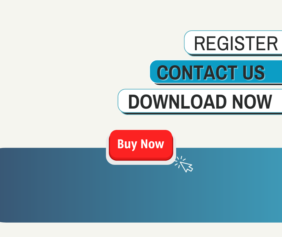
Think of CTAs as the tour guide leading your audience in a direction based on what you’re talking about in the marketing campaign content. The CTA is a major part of your strategy even if it’s a simple offering from the landing page to download a white paper, checklist, or case study. You want them to see the CTA so be sure it is above the fold and easy to read. Once they download and fill out the form, you will begin to amass email addresses and contact information that will move the marketing process forward.
You have to ensure that the mobile experience is right on point with the CTA. Looking at a 44 x 44-pixel count for a call-to-action button, you want to use contrasting colors that really pop. Then there are sticky CTAs, which means the CTA sticks to the side of the screen, so the user always sees it no matter what when they scroll or not. You might think of a sticky CTA as a chat bot, staying there in the corner wherever you’re scrolling.
From a mobile perspective, make the CTA easily tappable. And consider the thumb placement. Make it easy to click with your thumb and follow the next step. Also, white space around the CTA buttons so it’s visually noticed is important. Test the CTA on your own phone and see how it feels to you.
If you use video intros and transitions as part of your CTA, be sure to have it on autoplay, so the audio doesn’t start on its own. You can also use captions to avoid unwanted audio.
CTAs should create a sense of urgency for the user to take a desired action. Use them on a webpage to let the user know what to do next. Without a clear CTA, the user may not know the next steps to take to purchase a product or download a free document or sign up for a newsletter. When this happens, they are likely to leave the site without taking any action.
TIP #3
Refining the User Experience
Regardless of the content you’re creating, the user experience needs to be as enhanced as possible. Is it optimized for mobile? Is it easy to navigate? These are all things about the user experience that you can control. And on mobile, you can look at those. Google has testing tools, and you can see how the page loads. Much of how you perform on mobile will affect your ranking.
You want images correctly sized. If you have a video, most likely you should have it on YouTube or another platform so that the bandwidth is not slowing your website down.
Google has analytics available in a search console that you can connect and see pages visited. How did people search to get to your website? You can learn a lot from these tools. There are also things you can add like heat map data.
You might want to try something for a month or two, especially on a high traffic time of year for your business. Look at the heat maps. See what people are putting their cursor over? Where are they tapping? That will show you what they're looking at.
When you start to see heat map smudges of action, you can analyze what you're saying and what people are seeing first. It may affect where your call-to-action button is located. It may affect where you put a graphic.
If you put a graphic top left, maybe it shouldn't be. Maybe you want that first thing they see to be a word or something, and then the graphic supports it because you're going to see it a little easier.
The goal is to make the user journey from conversion as seamless as possible, whether it’s from a landing page to conversion or from homepage to newsletter, subscribe, or fill out the form and download the content.
Take a look at traffic on your website. Where does it start? Where do they come in? This is not so much about a landing page, but more a general website. Where do they go first? Is it a blog? Is it the team page? Is it the homepage? And from there, where do they go?
The question is, if someone leaves after that, either they got what they wanted, and that's really all they wanted, or nothing compelled them to do the next thing, right? So, wouldn't it be nice if they were subscribing to a newsletter or reading more about the founder? Maybe the about page could have more about the owner.
If it's a website page maybe a website evaluation checklist is a good thing to do. Start thinking about what's next for each page. For instance, someone went to this page. If they don't want to talk to me yet, what's the most logical thing that they would benefit from? And that's where you can really valuably grow your site.
We must understand that buyers are on an entirely different journey now than they were five or ten years ago. And we really have to meet them where they are in that process.
Establishing trust is vital, so give them things that show your expertise. Perhaps a specific service page, or show them a tool that helps them, show them a testimonial of someone you've done this specific thing for, thoughtfully pairing things and ideas, then go from there.
Think about someone going. Think about someone coming back a couple of days later, like this sort of sporadic activity. How can you make that into a journey if it's not all happening in a 10-minute session. Less and less happens in one experience nowadays.
Think about a service related to a specific case study, testimonial, or a lead magnet that you can provide. Look at your services page. You should have a page for each service, so start thinking about that service you have that can help someone.
Follow Kristina and Debra on LinkedIn or Spotify and join them on their weekly podcast, Ready Set Action. They want to know what drives your business and how they can help. Call in the experts and learn new ways to grow your business.

